Starbucks Mate Identity Design
Starbucks Mate is the concept of a new Starbucks product: an energy drink made from the Yerba Mate plant, a plant that is consumed usually as a hot infusion in South America. The aim of this project is to show the process of branding and identity development within the company’s design brand guidelines.
The design of the brand was part of the overall UX/UI project development.
What’s the core of the product?
When creating a Visual Identity for an energy drink made from the Yerba Mate plant, I first created a moodboard with visual inspiration.
Taken inspiration from similar products on the market, colours and textures Starbucks uses on their designs and old text book illustrations from the Yerba Mate plant.

Ideation
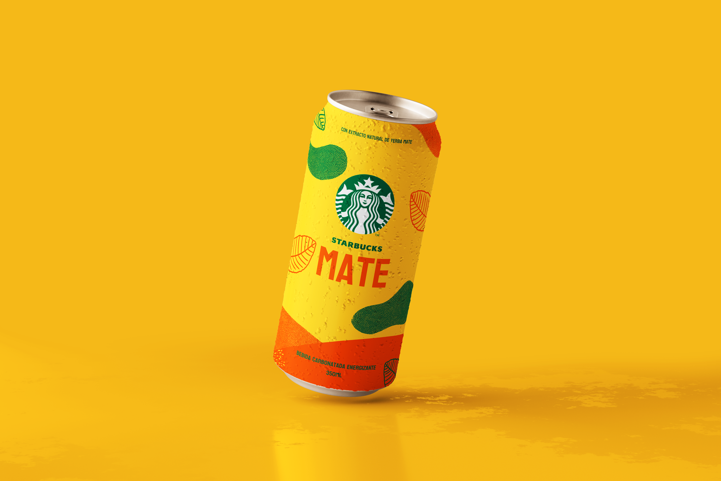
Mate has to POP from shelves and stores, so fun, vibrant colours, textures and shapes were my first approach to the design.

First sketch of concepts for labels and web graphics

First exploration of possible colours and shapes
To work on the label, I’ve chosen a colour palette with yellow and orange, pairing them up with Starbucks’ signature green. Both yellow and orange are very energetic colours and combined with a bold typography like Koulen and illustrations, the result is the desired bold yet on brand image for our product.


Testing colours and textures on the label